
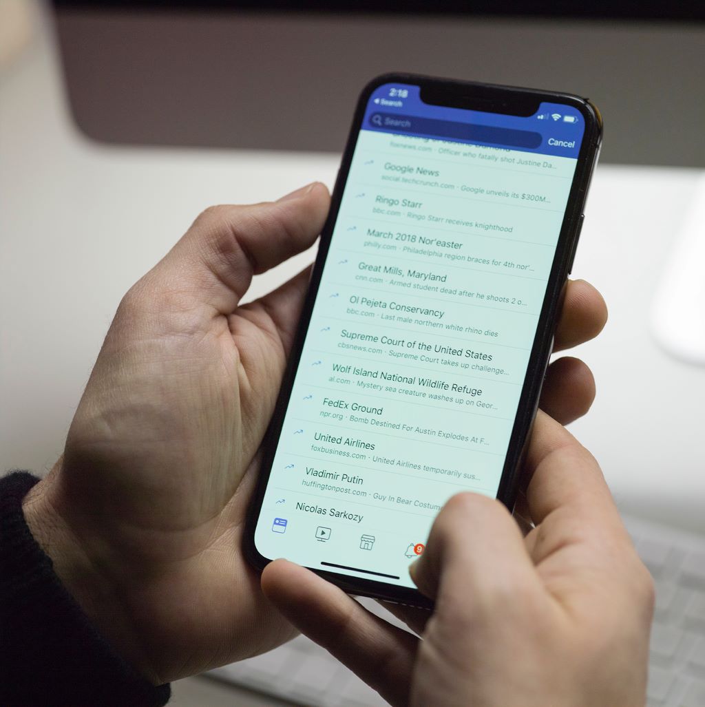
In today’s digital landscape, mobile devices reign supreme. More than half of all website traffic now comes from smartphones and tablets, and that percentage grows every year. For businesses and organizations looking to reach modern audiences, optimizing the mobile experience is no longer optional – it’s absolutely essential.
Adopting a mobile-first approach to design and development ensures that your website or app will not only be accessible on mobile but optimized for how users interact on these devices. With mobile-first design, the small screen is no longer a limitation but rather the canvas on which you can deliver an exceptional user experience.
We’ll explore what exactly mobile-first design means, why it’s critical for both user experience and search engine optimization, and how to execute it effectively. Let’s dive in!
What is Mobile-First Design?
Mobile-first design is an approach to web design and development that prioritizes the mobile experience over the desktop experience. The goal is to structure your website or app UI so it provides an intuitive, streamlined, and enjoyable experience for mobile users from the very start.
With mobile-first design:
- Mobile optimization is built into the project from day one, not tacked on at the end.
- The mobile interface sets the foundations for the eventual desktop site.
- Design decisions and information architecture cater to the capabilities and constraints of mobile devices first.
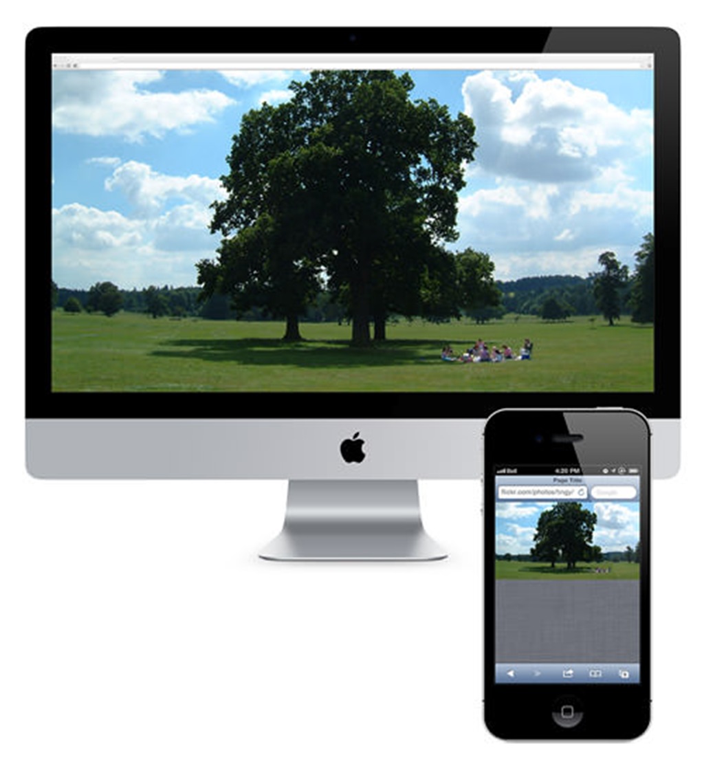
This contrasts with the outdated desktop-first approach, where the desktop website was designed first, and the mobile experience was an afterthought. With desktop-first design, issues like small screens, fat fingers, and distracted mobile users were addressed late in the process, if at all.
With a mobile-first methodology, you can create experiences tailored specifically for the unique ways people interact on their smartphones and tablets. The rise of mobile-first parallels the meteoric increase in mobile adoption over the past decade. Let’s look at some statistics that highlight the ongoing mobile revolution:
- Mobile internet usage has surpassed desktop usage worldwide.
- 91% of adults in the US own a smartphone.
- 50% of online traffic in North America now comes from mobile devices.
- 60% of Google searches are conducted on mobile.
- 80% of Facebook’s ad revenue comes from mobile advertising.
Given the dominance of mobile, focusing on smaller screens first when designing websites and apps simply makes sense. In the next sections we’ll explore the many benefits this approach offers for UI/UX and SEO.
Enhancing User Experience with Mobile-First
Structuring your project around mobile-first principles offers a wealth of advantages when it comes to optimizing user experience. Let’s look at some of the key ways mobile-first design enhances UX:
Faster Load Times
Site speed is a critical ranking factor for Google and other search engines. It’s also hugely important for user experience – fast page loads keep visitors engaged, while slow load times lead to frustration and abandonment.
By designing for mobile first, you can minimize bloated code and assets that slow down load times. Mobile-first means stripping away everything non-essential and optimizing performance for the start. The result is a leaner, faster mobile experience users will appreciate.
Streamlined Layouts
Mobile-first design forces you to be disciplined with layouts. There simply isn’t room on a 5-inch screen for extraneous, cluttered interfaces. Every element must have purpose.
With a mobile-first approach, you create streamlined, minimalist interfaces that get straight to the point. This improves usability and reduces cognitive load for users, especially those dipping in and out on the go.
Targeted Content Delivery
Mobile contexts vary wildly from desktop contexts. On mobile, people tend to seek out different types of information than desktop users. They also tend to interact in shorter bursts, often distracted.
By designing mobile-first, you can tailor content specifically to match mobile usage patterns. This might mean displaying key details up front, using accordions to hide secondary content, reducing word counts, or providing contextual overlays. Optimizing content for mobile scenarios enhances relevance.
Focus on Core Tasks
Mobile lends itself to accomplishing core tasks quickly. While desktop users are more inclined to meander and browse, mobile interactions tend to be more purposeful.
Mobile-first design pares down interfaces and workflows to the most essential functions. Any nice-to-have features get stripped away in favor of enabling users to complete primary tasks as efficiently as possible. This emphasis on utility caters to behavior on mobile devices.
Better Touch Targets
Fat fingers are a real mobile struggle. If buttons and touch targets are too small or cramped together, clicking the right element becomes an exercise in frustration.
With a mobile-first approach, you can ensure tap targets are appropriately sized and have enough surrounding space through margin and padding. This makes interfaces effortless to interact with using a touch screen.
These examples demonstrate the tangible UX gains of embracing a mobile-first mindset from the initial stages of your project. In addition to enhancing user experience, mobile-first design also offers significant SEO benefits. Let’s examine those next.

Improving SEO with Mobile-First
While Google’s mobile-first indexing rollout concluded in 2021, optimizing for mobile search remains crucial. Here are some of the key ways that prioritizing mobile boosts your SEO and discoverability:
Higher Mobile SERP Rankings
Google still uses mobile-friendliness as a ranking factor. All else being equal, sites with excellent mobile UX tend to perform better in mobile SERPs compared to non-mobile-friendly sites. If your site isn’t mobile-friendly, you’re effectively ceding ground to competitors with every search on mobile.
By building mobile-first from the ground up, you maximize your mobile optimization and command the top spots for valuable mobile keywords.
Faster Page Speed Metrics
As mentioned already, site speed is a top SEO factor. And page speed is especially crucial on mobile, where sluggish load times feel even more pronounced.
Adopting mobile-first practices like performance budgeting, image optimization, and clean code produces blazing fast mobile speed metrics. This directly strengthens your page experience signals in Google’s eyes.
Lower Bounce Rates
High bounce rates indicate a poor user experience that causes visitors to leave your site quickly. This signals Google that your pages aren’t satisfying searchers’ intent well.
By crafting user flows tailored for mobile, you minimize bounce rates. Mobile users are much more likely to engage with your content rather than abandoning your site. Lower bounce rates improve rankings.
Enhanced Click-Through Rates
Click-through rate measures how appealing your snippet appears in SERP listings. A compelling title, meta description, and preview image makes users more likely to click through to your site.
Optimizing your page for the constraints of mobile search results in a more engaging snippet. This directly translates into higher CTRs and more organic traffic.
Higher Ad Revenue
With over 50% of Google traffic now on mobile, it’s simply bad business to not optimize for mobile searchers. If your site isn’t mobile-friendly, you miss out on revenue from mobile users who would have clicked on ads but bounced instead.
Embracing mobile-first principles ensures you provide a stellar experience across all devices, enabling you to maximize conversions and ad revenue.
Executing Mobile-First Design: Actionable Strategies
Now that we’ve covered the many advantages of mobile-first, let’s dig into some proven tactics for baking it into your design and development process:
Start with Mobile Wireframes First
When initially laying out key pages and flows, focus your efforts on mobile wireframes. Work through the information architecture and interaction flows for small screens first.
By starting with mobile, you can ensure the mobile experience provides a logical, seamless user journey. Then, you can build up from there when creating the desktop wireframes.
Use a Mobile-First CSS Framework
CSS frameworks like Bootstrap and Foundation embrace mobile-first principles in their underlying structure. They incorporate styles for crucial things like media queries, responsive images, and fluid grids out of the box.
Leverage one of these mobile-first frameworks as the foundation for cross-device styling. Add custom CSS on top to further optimize for mobile.
Implement Mobile Interaction Patterns
Certain UI patterns work particularly well on mobile due to the unique constraints. For example, full page overlays for additional details, bottom navigation bars, and expand/collapse sections all provide excellent mobile user experience.
Research mobile patterns and incorporate ones that align with your mobile context. Also analyze competitors and apps for ideas you can apply.
Size Tap Targets Appropriately
As mentioned earlier, tap targets need to be large enough on mobile. According to design guru Steven Hoober, optimal sizes for touch areas are at least 44px x 44px for younger users, and closer to 57px x 57px for older users.
Ensure buttons, links and touch points meet or exceed these sizing guidelines throughout your mobile experience. Don’t cram things too close together.
Use Mobile-Optimized Forms
Typing on mobile devices presents some friction. Minimize this by optimizing forms for mobile contexts.
Strategies include minimizing required fields, using dropdowns versus free text, implementing smart autocomplete, and utilizing larger input fonts. Also make sure to size and space fields appropriately.
Simplify Mobile Page Layouts
Cluttered, dense interfaces don’t work well on mobile screens. Be ruthless in minimizing unnecessary page elements to only the essentials.
Use white space, sparse multi-column layouts, and utility-focused designs to craft clean, focused mobile page layouts. Progressively disclose non-critical content as needed.
Reduce Mobile Image Sizes
Large image files slow down mobile load times significantly. Compress and resize photos to only what’s necessary for mobile screens.
Leverage responsive image solutions to serve different size images based on device. Also lazy load below-the-fold images to defer loading until needed.
Use Mobile-Optimized Content
As discussed earlier, content should be tailored for mobile contexts. Write shorter paragraphs in a scannable style optimized for distracted mobile users. Use descriptive headers, lists, and other formatting to chunk up long blocks of text.
Also consider content that addresses intent specific to mobile, like info to enable quick decision-making for on-the-go users. Hyper-focused mobile content provides value.
Test Extensively on Real Devices
Mobile testing shouldn’t be an afterthought. Extensively test flows and critical pages on physical devices during development. Pay special attention to speed, usability, and mobile conversion paths.
Ideally, conduct user testing on mobile too. Observing sessions with real users often reveals mobile UX issues that may have otherwise slipped through the cracks.
By following these mobile-first best practices throughout your design and development cycle, you can craft exceptional user experiences optimized for the small screen.
Key Takeaways
Here are the core things to remember about mobile-first design:
- Mobile-first means prioritizing the mobile experience over desktop during all phases of design and development.
- Mobile now accounts for over half of all web traffic globally, making mobile optimization critical.
- Designing mobile-first significantly enhances user experience through focused content, streamlined interfaces, faster speed, and seamless core tasks.
- Mobile-first also boosts SEO by improving page speed, engagement, click-through rate, and mobile SERP rankings.
- Effective mobile-first strategies include wireframing mobile flows first, using mobile-friendly frameworks, simplifying layouts, resizing images, and extensive mobile testing.
By embracing a mobile-first mindset today, you can craft next-level user experiences while staying ahead of the mobile-led future.
Frequently Asked Questions
Q: Do you still need a desktop site if you design mobile-first?
A: Yes, you still need a desktop experience even with a mobile-first approach. The idea is that the mobile experience lays the foundation, then the desktop site builds on top of that. Always design responsively to provide an optimized experience across devices.
Q: What are some examples of mobile-first designed sites?
A: Many modern sites like Medium, Stripe, Mailchimp, Instacart and Tinder use mobile-first design principles. Their interfaces are streamlined with the most important tasks easily accessible. Content is concise and scannable. Speed is also optimized.
Q: Is mobile-first design more expensive?
A: Done properly from the start, mobile-first design doesn’t inherently increase costs. In fact, optimizing for constraints can drive creativity and focus. Just be sure to gather mobile requirements upfront and allocate sufficient testing resources. Refactoring after the fact is what really drives up costs.
Q: How do you get buy-in on mobile-first design?
A: Emphasize the business benefits: higher engagement, conversions, and revenue. Present mobile stats and trends so stakeholders understand the growing dominance of mobile. Set company-wide mobile-first mandates to align all teams on mobile as the north star.
Q: Does mobile-first design apply to apps too?
A: Yes, absolutely. For native mobile apps, designing mobile-first is essentially built-in since the mobile experience is the experience. But even for cross-platform apps, prioritizing mobile UX principles helps craft intuitive interfaces optimized for mobile usage.
Conclusion
Mobile has fundamentally reshaped the digital landscape. Users are increasingly living their lives through smaller, portable screens.
This epochal shift makes optimizing the mobile experience mandatory. By embracing a mobile-first approach starting from the initial design stages, you can build mobile products tailored to the way modern consumers engage on smartphones and tablets.
Mobile-first design not only enables you to create interfaces and experiences that feel native to mobile but also unlocks significant benefits for user experience, conversions and search visibility.
As global mobile adoption shows no signs of slowing down, mobile-first principles will only grow in importance in the coming years. Companies that neglect the mobile experience do so at their own peril. Mobile-first must be the mantra going forward to connect with modern users and drive success.